Let’s be honest—fast food isn’t just about convenience. It’s about indulging in a quick, satisfying meal that feels like a small reward on a hectic day. Among the many fast-food chains out there, Wendy’s stands out. From their iconic square burgers to the sweet, creamy Frosty, Wendy’s has carved a unique spot in our hearts (and stomachs). But have you ever noticed the clever detail hidden in Wendy’s logo? It’s subtle, ingenious, and changes the way you see this fast-food giant forever.
A Logo Rooted in Family History

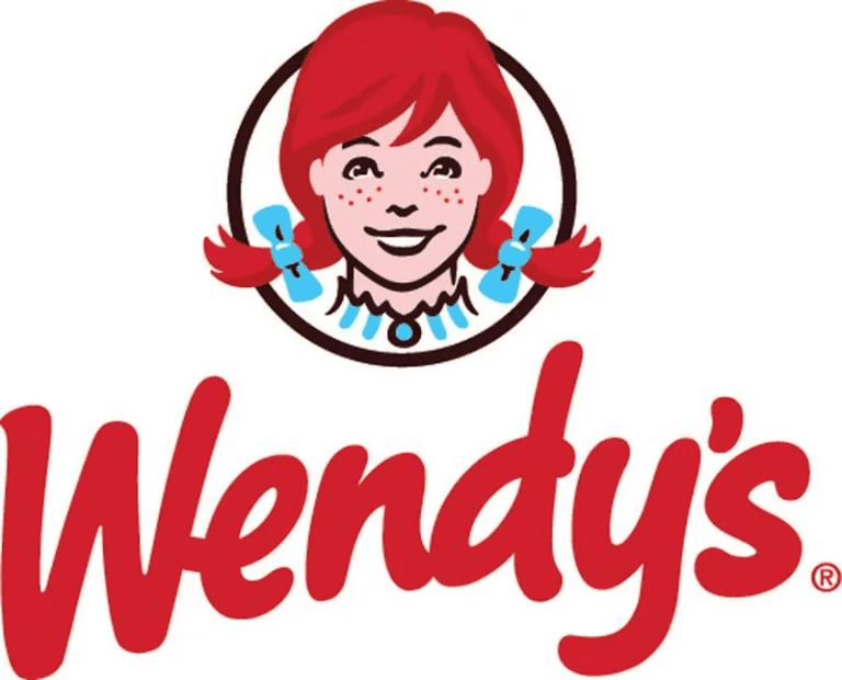
Wendy’s isn’t just a business—it’s a family story. Founded in 1969 by Dave Thomas, the chain gets its name from Dave’s daughter, Melinda, who went by the nickname “Wendy.” The logo, with its cheerful red-haired, freckle-faced girl, reflects this personal connection. It’s a symbol of warmth, family, and tradition. But there’s more to the design than meets the eye.
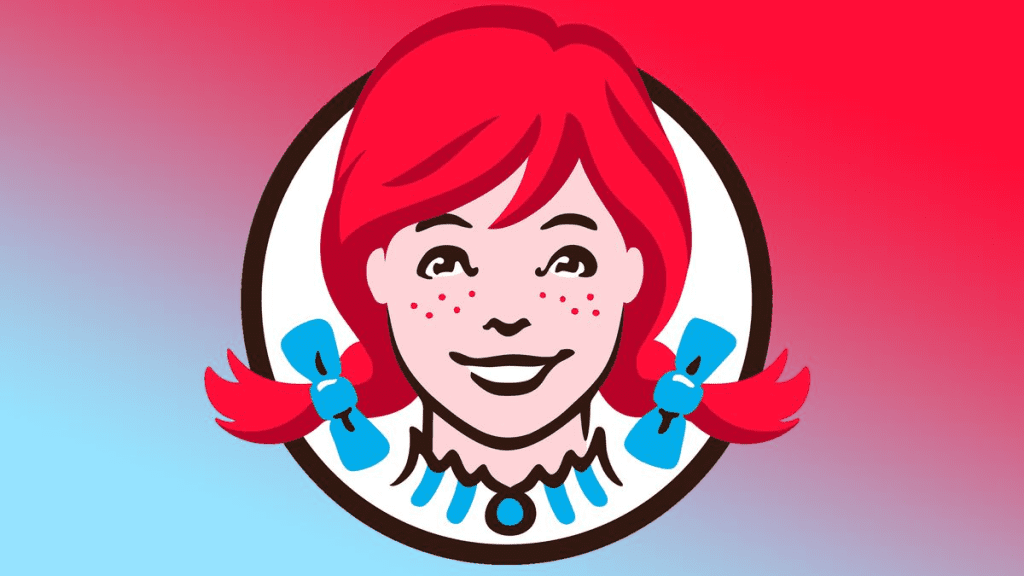
If you take a closer look at Wendy’s logo, particularly the collar of the girl’s blouse, you’ll notice something remarkable. Hidden within the ruffles of her collar is the word “MOM.” While it’s subtle and easy to miss, this design choice is anything but accidental.
The Meaning Behind the Hidden “MOM”
The inclusion of the word “MOM” in Wendy’s logo is more than just a clever Easter egg—it’s a message. It symbolizes comfort, home-cooked meals, and the kind of care and love that reminds you of your mom’s cooking. This subtle nod to nostalgia aligns perfectly with Wendy’s brand identity, which emphasizes quality and freshness over the typical fast-food experience.
What does this hidden “MOM” communicate to customers? It says that Wendy’s isn’t just serving fast food—they’re offering meals that feel personal and thoughtful. It’s a subtle but powerful reminder of the chain’s promise to deliver quality food made with care.
Why Hidden Messages in Logos Matter
Wendy’s isn’t the only brand to weave hidden elements into its logo. Cleverly designed logos with hidden messages captivate us, creating a sense of connection and curiosity. Here are a few other examples that demonstrate the power of subtlety in branding:
- FedEx: The logo features an arrow hidden between the “E” and “x,” symbolizing speed, precision, and forward motion.
- Toblerone: Within the mountain graphic of the Toblerone logo, you’ll find the outline of a bear, a tribute to Bern, Switzerland, the brand’s birthplace.
- Amazon: The arrow in Amazon’s logo stretches from A to Z, representing the company’s wide range of products.
These hidden details make logos more than just branding—they tell stories, spark conversations, and stick in our minds.
How Wendy’s Stands Out in the Fast-Food Industry

The fast-food world is a crowded marketplace, with major players like McDonald’s and Burger King vying for dominance. So how does Wendy’s manage to hold its own? By focusing on its unique strengths: fresh ingredients, a playful personality, and a brand that feels approachable and human.
The hidden “MOM” in Wendy’s logo is a subtle yet brilliant example of this. It reinforces their message of home-style meals and builds an emotional connection with customers. Whether you realize it or not, seeing “MOM” in the logo triggers feelings of comfort and nostalgia—exactly what you want from a meal.
The Psychology Behind Hidden Messages in Logos
Why are we so fascinated by hidden messages like the one in Wendy’s logo? The answer lies in psychology. Discovering something hidden feels like solving a puzzle—it triggers a sense of delight and satisfaction. This positive emotional response strengthens our connection to the brand.
Once you spot a hidden detail, it’s impossible to unsee it, and you’re likely to share it with others. This creates buzz and free publicity, as people discuss and share the discovery. Wendy’s “MOM” is a prime example of how a small design choice can have a big impact on customer engagement and loyalty.
How the “MOM” Reflects Wendy’s Brand Values
At its core, Wendy’s brand is about delivering quality meals with a home-style touch. Their menu items, like baked potatoes, chili, and fresh salads, are designed to feel hearty and familiar—like something your mom might make for you. By embedding “MOM” in the logo, Wendy’s reinforces this identity in a subtle yet meaningful way.
This detail may go unnoticed by the average customer, but for those who spot it, it adds an extra layer of trust and warmth to the brand. It’s a reminder that Wendy’s is about more than just convenience—it’s about creating an experience that feels personal and caring.
The Role of Nostalgia in Wendy’s Marketing

Nostalgia is a powerful tool in marketing, and Wendy’s leverages it masterfully. From the “MOM” in the logo to their old-fashioned burgers, the brand constantly reminds customers of simpler, more comforting times. Even their cheeky and relatable social media presence taps into this idea, making Wendy’s feel less like a corporation and more like a friend.
By tying their brand to emotional experiences—like the warmth of a home-cooked meal—Wendy’s creates a lasting impression that goes beyond taste and convenience.
Next Time You See the Logo, Take a Closer Look
Now that you know about the hidden “MOM” in Wendy’s logo, you’ll never see it the same way again. That tiny detail transforms the logo from a simple design into a statement about family, care, and quality. It’s a reminder that even in the fast-paced world of quick-service restaurants, there’s room for thoughtfulness and creativity.
So, the next time you unwrap a Wendy’s burger or dip fries into a Frosty, take a moment to appreciate the story behind the logo. It’s a testament to the brand’s commitment to making every meal feel a little more special.
Conclusion: The Genius of Wendy’s Hidden Message
Wendy’s “MOM” isn’t just a clever design trick—it’s a symbol of everything the brand stands for. From their fresh, never frozen beef to their dedication to customer satisfaction, Wendy’s has always aimed to create a dining experience that feels personal and comforting. The hidden “MOM” in their logo ties it all together, making it a subtle yet powerful part of their identity.
In a world where fast food often feels impersonal, Wendy’s reminds us that small details can make a big difference. Whether it’s a perfectly cooked burger or a thoughtful design element, Wendy’s has mastered the art of making us feel at home, one meal at a time.


